Film Looks in AI Images: Grain, Halation and Classic Stocks
How to prompt a believable analog film look: grain size, halation, highlight rolloff and the color habits of classic stocks, with before and after prompts.
Visual AI Club8 мин чтения
Этот гайд написан на английском.
Most film-look prompts come back as a brown, faded picture with fake dust on it. Real film has a handful of specific physical traits, and once you can name them, you can ask an image model for exactly the analog look you want. This guide breaks those traits down and shows how to write them so the result reads as a scanned negative, not a filter.
What film actually does to a picture
A digital sensor records light in a fairly linear way and clips hard when a highlight gets too bright. Color negative film responds differently: it compresses bright tones gradually, so a sunlit window fades into a soft creamy white instead of a flat patch. Photographers call this highlight rolloff, and it is the single biggest reason film portraits feel gentle.
Film also has a grain structure made of silver halide crystals that become dye clouds after development. Grain is not noise sprinkled on top; it is the image itself, and it is most visible in midtones and smooth areas like skies and skin. Faster film, rated ISO 400, 800 or higher, has larger crystals and therefore coarser grain than slow ISO 100 film.
Then there is color. Every stock was engineered with its own response curve, so one renders skin warm and peachy, another pushes greens and cyans, and a tungsten-balanced cinema film turns daylight scenes cool blue. When you name a stock or describe its habits, you are really describing that curve.
- Rolloff: highlights fade softly instead of clipping.
- Grain: organic texture that scales with film speed and shows most in midtones.
- Halation: a red or orange glow around bright light sources.
- Color response: each stock leans warm, cool, saturated or muted in its own way.
- Lower micro-contrast: fine edges look a little softer than on a modern sensor with sharpening.
Grain: choose a size, not just a word
Image models treat the word grain as a dial with no number on it. You get far more control by tying the grain to a film speed and a format. A 35mm frame is small, so the grain is enlarged more and looks more prominent. Medium format (6x6 or 6x7) uses a much larger negative, so the same film looks smoother and more detailed.
| What you write | What you tend to get | Good for |
|---|---|---|
| fine grain, ISO 100 film, medium format | Smooth tones, gentle texture, high detail | Portraits, landscapes, quiet editorial |
| visible grain, ISO 400 35mm film | Classic everyday snapshot texture | Travel, family moments, street |
| heavy grain, ISO 3200 film pushed two stops | Gritty, contrasty, almost sandy texture | Night scenes, concerts, moody black and white |
| grain mostly in the shadows and sky | Texture that stays off the face | Close portraits where skin should stay clean |
Pushing film means underexposing it and developing longer. It raises contrast and grain at the same time, so pushed two stops is a compact way to ask for both.
Halation and the glow around lights
Halation happens when bright light passes through the emulsion, bounces off the film base and exposes the layers again from behind. Because the red-sensitive layer sits deepest, the glow it leaves is usually red or orange. Most still films have an anti-halation layer that reduces this, which is why halation became strongly associated with cinema film shot in still cameras, where that layer has been removed.
In a prompt, halation only works when there is something bright to glow: street lamps, neon, car headlights, a backlit window, the sun clipping through leaves. If your scene is a flatly lit room, asking for halation produces a random reddish haze instead. Put the light source in the frame first, then describe the glow.
A woman waiting at a tram stop at night, film look, halation.
A woman waiting at a tram stop at night under sodium street lamps, a lit tram approaching in the background. 35mm color negative film, ISO 800, soft red halation blooming around each lamp and the tram headlights, cool blue shadows, visible grain.
The second version gives the model a reason for every effect. The lamps explain the halation, the night explains the high ISO, and the high ISO explains the grain. Effects that are justified by the scene look physical; effects that are just listed look pasted on.
Classic stocks as shorthand
Naming a well-known film stock can work as compressed vocabulary, because image models have seen many captioned photos that mention them. Treat the name as a hint, though, and always add the traits you care about in plain words. If the model does not recognize the name, the plain words still carry the look.
Warm portrait negative
Kodak Portra films are known for natural, warm skin tones, fine grain for their speed and very forgiving highlights. Pair the name with soft peach skin tones, creamy highlights, low contrast and you have a reliable portrait look for golden hour or overcast light.
Saturated landscape negative
Kodak Ektar 100 is a slow, very fine-grained film with strong saturation, often used for landscapes. Describe it as vivid blues and reds, punchy contrast, extremely fine grain. It is a poor choice for close skin, which can turn ruddy.
Cool, green-leaning consumer film
Many Fujifilm color films are remembered for cooler tones and distinctive greens. Words like slightly cool, minty greens, clean whites capture the feel even without a stock name, which helps when you want a summer-in-the-park snapshot.
Tungsten cinema film
CineStill 800T is motion-picture film adapted for still cameras, balanced for tungsten light around 3200K and known for strong halation. Under warm street lights it looks neutral; in daylight it turns noticeably blue. Ask for tungsten-balanced film, teal night tones, red halation around lights.
Classic black and white
Kodak Tri-X and Ilford HP5 are both ISO 400 black and white films with a recognizable grain and broad tonal range. For more on tone and contrast in monochrome, see black and white portraits.
Era is not the same as film
A common mistake is asking for a 1980s photo and expecting film texture to appear by itself. The model will often deliver clothing, hair and props from the decade but render them with crisp digital clarity. Era describes the content of the frame. Film describes how the frame was captured. You need both if you want the picture to feel like it came out of a shoebox.
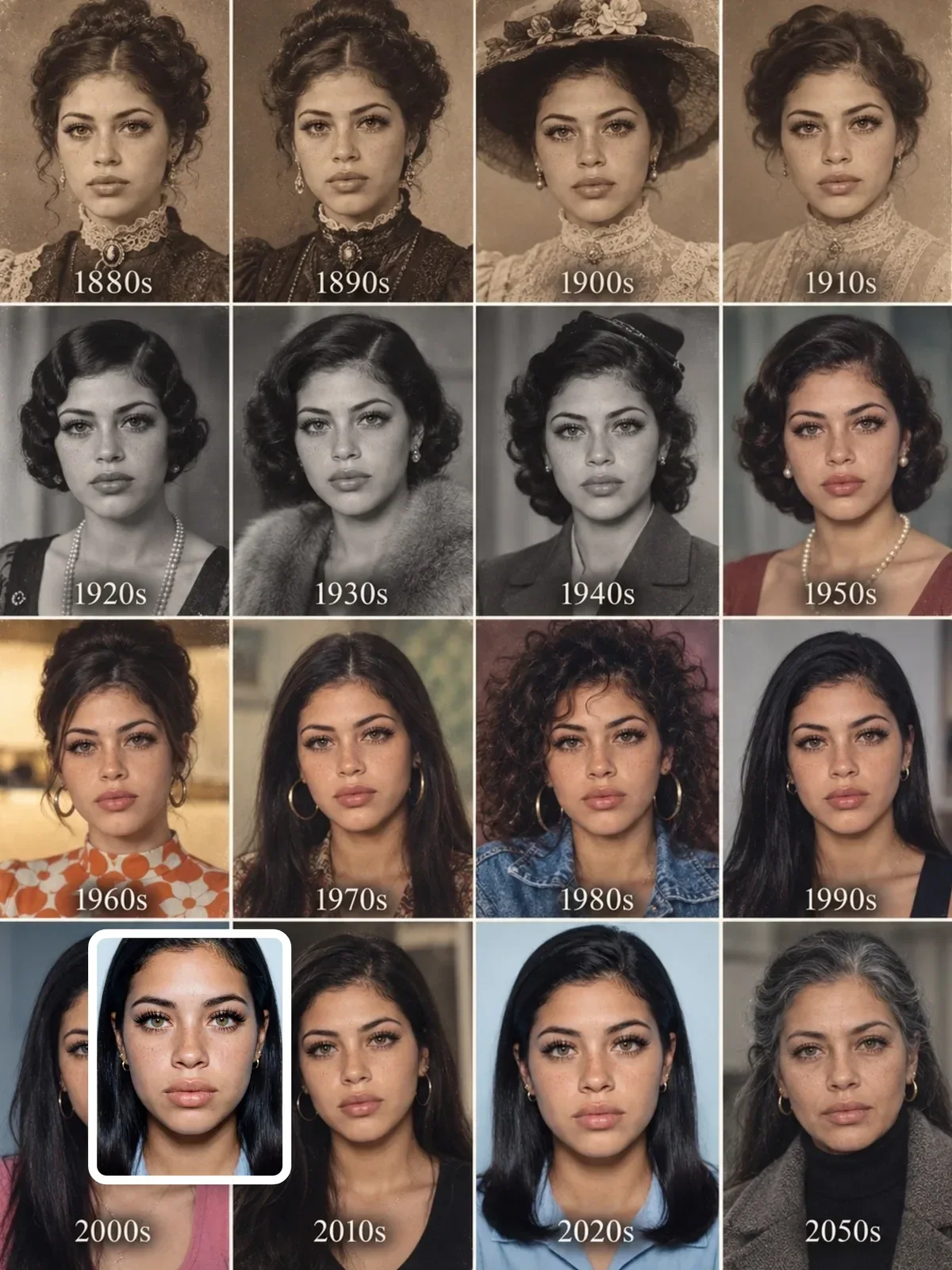
The 80s retro portrait prompt is a good example of combining the two: it builds a believable mid-80s setting and then treats the photograph itself as a period object. The same split explains why a decades timeline grid needs a different capture description per row, from glass-plate softness to color negative to digital.


- Capture medium: 35mm color negative, instant film, medium format slide film.
- Camera habits of the era: on-camera flash with hard shadows behind the subject, slightly off-level framing, date stamp in the corner.
- Print or scan: glossy 4x6 print with rounded corners, matte lab print, flatbed scan with slight dust.
Instant film is its own category: smaller tonal range, soft focus, shifted colors and a white frame. Say instant film print with white border rather than relying on a product name.
Light that film loves
Film looks best when the light suits its strengths. Negative film handles overexposure gracefully, so bright backlight, hazy sun and window light are flattering. It handles underexposure badly, so deep shadows turn muddy and grainy. If you want a clean film portrait, place the subject in generous light; if you want grit, put them in the dark.
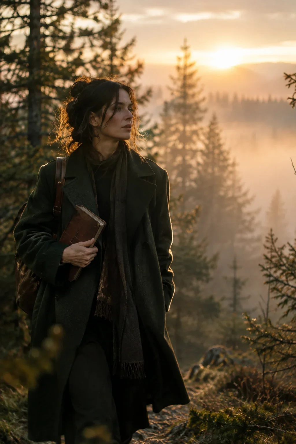
The forest scene used as the cover of this guide shows the idea: misty sunrise light with a 50mm lens gives soft, low-contrast tones that film handles beautifully. For timing that light, see golden hour and blue hour.

Portrait of a man reading on a balcony, sunny afternoon, film style, vintage colors.
Portrait of a man reading on a balcony, late afternoon sun behind him, slightly overexposed. 35mm color negative film with warm skin tones, soft highlight rolloff in the bright sky, fine visible grain, slightly lifted blacks, 50mm lens at f/2.
How to avoid the fake-filter look
The most unconvincing film images share a few habits. They stack every effect at full strength, they add damage that real negatives rarely show, and they apply one global color cast instead of a curve that treats shadows and highlights differently.
- Pick one strong trait. Either noticeable grain or noticeable halation, not both at maximum.
- Skip scratches and dust unless you want a damaged print. A clean scan of a good negative has neither.
- Describe split toning, not a tint. For example
warm highlights, slightly cool shadowsreads as film;sepia filterreads as an app. - Lift the blacks a little. Scanned negatives rarely have pure black, so
slightly faded shadowshelps. - Keep the lens believable. A 35mm or 50mm prime at f/2 to f/4 fits film; extreme bokeh at f/1.0 looks like a modern portrait mode.
If the result still looks too clean, change only the grain or only the stock name and generate again. Changing five things at once tells you nothing; the method in iterate one variable at a time applies perfectly here.
A ten-minute film test
Write one plain scene, such as a person sitting by a café window in the afternoon. Keep it identical and generate four versions, changing only the capture line each time. Put them side by side and note what changed in skin, highlights, shadows and texture.
- Warm portrait negative, ISO 400, fine grain, creamy highlights.
- Saturated slow landscape film, ISO 100, punchy contrast.
- Tungsten cinema film, ISO 800, red halation around the window glare.
- Black and white ISO 400 film, medium contrast, visible grain.
Save the version you like as a reusable capture line and paste it at the end of future prompts. Over time you will build a small personal set of film looks you can trust, which is far more useful than a long list of stock names you have never tested.