Composition for AI Images: Thirds, Leading Lines and Negative Space
Move your subject off center on purpose: how to prompt the rule of thirds, leading lines, negative space, frames within frames and depth layers in AI images.
Visual AI Club7 dk okuma
Bu rehber İngilizce yazılmıştır.
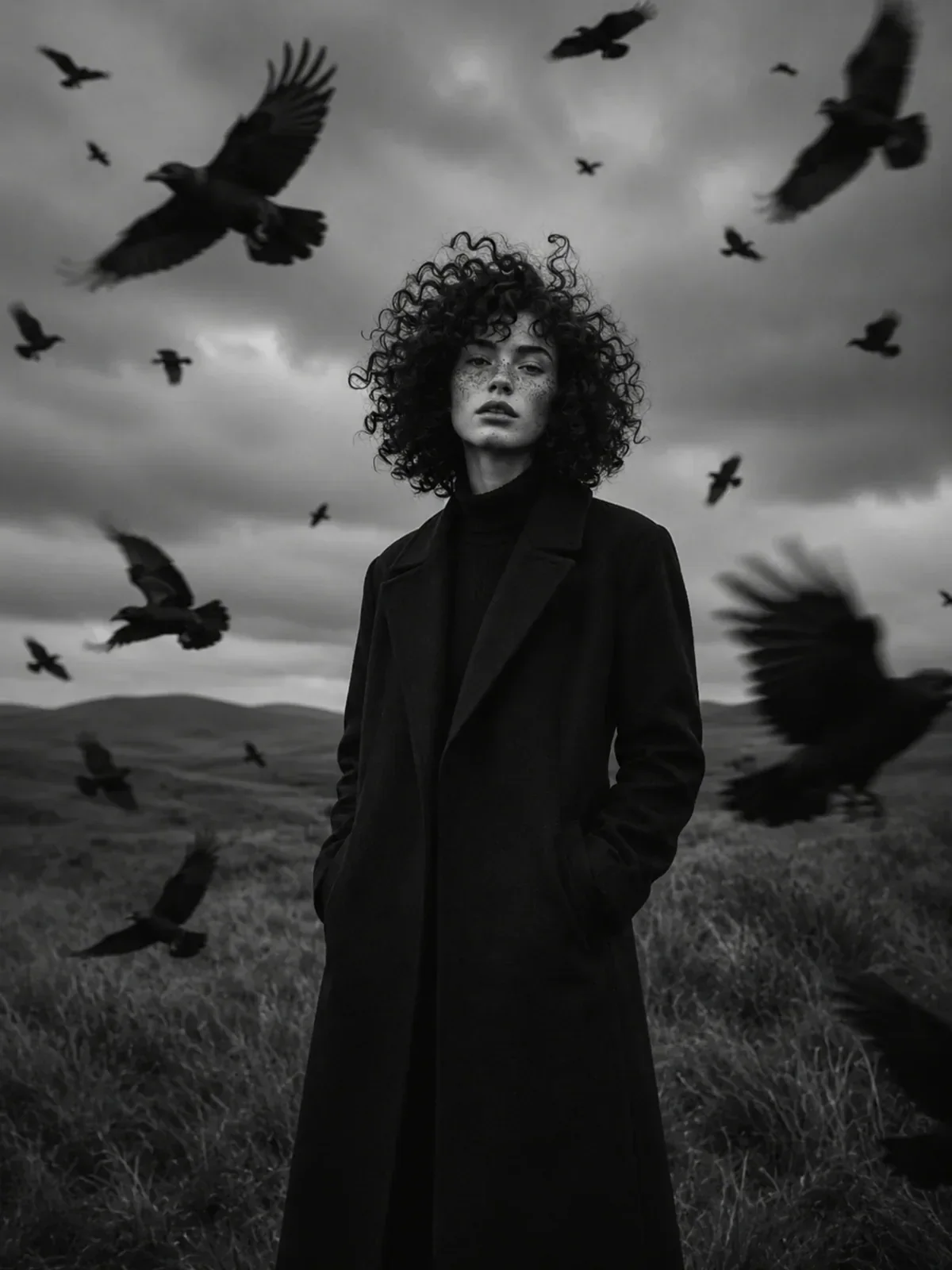
Image models love the middle of the frame. Ask for a person, a cup or a lighthouse and it will usually appear dead center, filling a comfortable amount of space, with nothing much going on around it. This guide shows you how to place things where you want them and how to use lines, empty space and layers to lead the viewer's eye.
Why AI images drift to the center
A model builds an image around what the prompt emphasizes, and the subject is almost always the most emphasized thing. Centering it is the safest way to show it clearly. Product photos, profile pictures and stock images, which models have seen in huge numbers, reinforce the habit.
Centered isn't wrong, but it's static. Off-center placement creates tension and movement, because the eye travels between the subject and the space around it. To get it, you have to name a position and give the rest of the frame a job. Saying off-center on its own rarely works; saying what fills the other side does.
The rule of thirds, written as positions
Divide the frame into three equal columns and three equal rows. The rule of thirds suggests placing important elements along those lines or near the four points where they cross, rather than in the exact middle. It's a guideline, not a law, but it reliably produces balanced, natural-looking images.
Models understand the phrase rule of thirds, yet they follow concrete positions better. Translate the rule into plain placement:
Subject standing on the left third of the frame, the right two thirds open to the sea.Horizon on the lower third line, sky taking up the top two thirds.Her eyes on the upper third line.This is the standard placement for portraits and keeps heads from floating too low.The lighthouse at the upper right intersection, rocks leading toward it from the lower left.
Give the subject room to look
When a subject faces or moves in a direction, leave space on that side. Photographers call it lead room or looking room. A cyclist riding to the right should sit on the left third with open road ahead. Put them on the right edge facing out of the frame and the image feels cramped, as if they're about to leave.
A cyclist riding along a coastal road at sunset, rule of thirds.
A cyclist riding from left to right along a coastal road at sunset, placed on the left third of the frame, with open road and glowing sea stretching ahead of her across the right two thirds.
Balance the visual weight
An off-center subject needs something on the other side to keep the frame from tipping. Not everything weighs the same: faces, bright areas, saturated colors, large shapes and any text pull the eye harder than dark, muted or small things. A person on the left third can be balanced by a bright window, a red umbrella or a small figure in the distance on the right. Name that counterweight in the prompt and the composition holds together.
Leading lines: paths for the eye
The eye follows lines. Roads, rivers, rails, fences, shorelines, shadows, staircases and rows of streetlights all pull attention along their length. When those lines point toward your subject, the viewer arrives at it without effort.
The trick in a prompt is to describe where the line starts and where it ends. A line that starts in a corner and ends at the subject is the strongest version.
A long wooden pier starting at the bottom center of the frame and running straight toward a small figure standing at its far end, with calm gray water on both sides and a pale sky.
- Converging lines (rails, a corridor, a tree-lined avenue) create strong depth and a clear vanishing point.
- Diagonals feel energetic; horizontal lines feel calm; vertical lines feel strong and formal.
- S-curves like winding rivers and mountain roads feel graceful and slow the eye down.
- Implied lines count too: a gaze, a pointing hand or a row of birds all direct attention.
Angle and lines work together. A low camera makes a road or pier stretch toward the horizon; an overhead camera turns the same lines into graphic patterns. See camera angles for AI images.
Negative space: the empty part that does the work
Negative space is the area around the subject that's left mostly empty: sky, a plain wall, still water, fog, snow. It makes a subject feel isolated, calm, small or important, depending on how much you leave. It also gives you clean room for a headline, which is why posters and ads depend on it.
Models fill empty space with details unless you tell them not to. Describe the empty area as a thing, with a texture and a size: the upper two thirds is an empty pale gray sky with no birds or clouds. That's more reliable than lots of negative space.


The minimal layered-cutout travel poster shows negative space doing design work: generous calm areas make the cut-paper city read clearly and leave room for type. The guide to clean text in AI images explains how to use that room for lettering.
The hero image of this article goes further: a lone figure in a huge, empty landscape. The more space around the subject, the stronger the feeling of scale and solitude.
Frames within the frame
A doorway, a window, an arch, a gap in the trees or a car's side mirror can surround the subject with a second frame. It focuses attention, adds depth, and often tells you where the photographer was standing, which makes the image feel observed rather than staged.
View through an open doorway from a dark hallway into a sunlit kitchen, where a man reads at a table. The dark doorframe surrounds him on all four sides.
Keep the framing element darker or softer than the subject so the eye passes through it. A shallow depth of field helps; see depth of field and bokeh.
Foreground, middle ground, background
Flat images usually have everything in one plane. Images with depth have three: something close to the camera, the subject in the middle, and a setting behind. Even a simple foreground element, like grass, a railing or the rim of a cup, makes a scene feel three-dimensional.
- Foreground: a texture or object near the lens, often slightly out of focus, at the bottom or edge of the frame.
- Middle ground: the subject, sharp and well lit.
- Background: the setting that explains where we are, softer or lighter with distance.
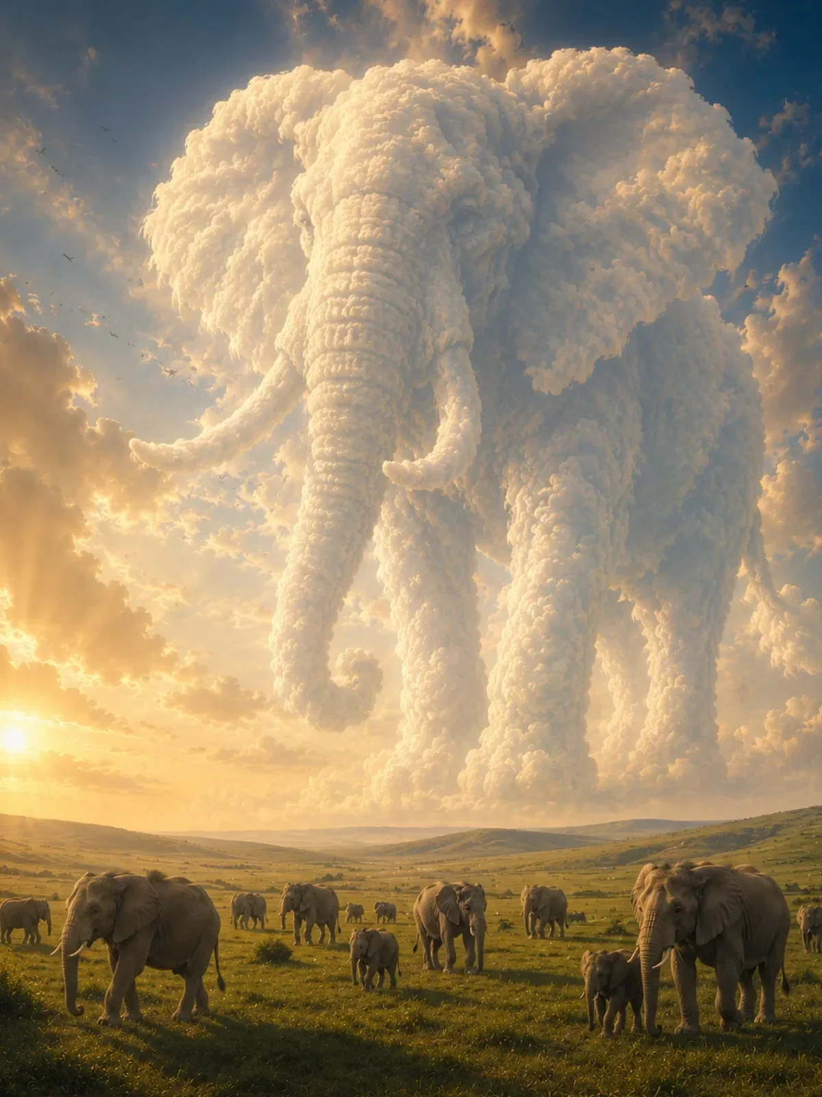
In the colossal cloud animal landscape, small animals in the foreground and an enormous shape in the sky create depth and scale at the same time. Remove the foreground animals and the sense of size collapses. The foreground doesn't need to be large to work; a sliver at the bottom of the frame is often enough to give the eye a starting point.
Watch the edges and tangents
Experienced photographers scan the edges of the frame before they press the shutter, and you should scan generated images the same way. Look for a lamppost growing out of a head, a horizon cutting exactly through someone's neck, a hand or foot cropped at a joint, or a bright object half-cut at the edge pulling attention outward. You can prevent most of these in the prompt: the horizon well below her shoulders, nothing directly behind her head, full figure with space above the head and below the feet.
When centering is the right call
Break the thirds rule deliberately when the subject is symmetrical or when you want confrontation and formality. Straight-on portraits, architecture with a central doorway, reflections in still water and product hero shots often look strongest perfectly centered. The key word is perfectly: perfectly symmetrical composition, subject exactly centered reads as a decision. Slightly off-center looks like a mistake.
Aspect ratio changes all of this, too. A vertical 9:16 frame stacks elements top to bottom, while a 16:9 frame invites side-by-side placement. Choose the ratio first; the aspect ratios guide explains which to pick.
Composition checklist for your next prompt
- Where exactly is the subject? Name a third, a corner or the exact center.
- Which way is the subject facing or moving, and is there room on that side?
- Is there a line leading to the subject? Say where it starts and ends.
- What fills the empty space, and should it stay empty?
- Is there a foreground layer to add depth?
- Does the aspect ratio suit the arrangement?
Answer these in one or two sentences of your prompt, then compare the result with your plan. If the model centered the subject again, move the placement sentence closer to the start of the prompt and describe the empty side in more detail.