Designing Travel Posters With AI: Art Deco, Cutout and Collage
Design AI travel posters that hold together: classic poster eras, layout zones for landmark and title, palettes per place, short type and print-ready ratios.
Visual AI Club6 dk okuma
Bu rehber İngilizce yazılmıştır.
A good travel poster can be read from across a room: one landmark, one mood, one name. AI tools can produce beautiful poster art in seconds, but without a plan they also produce busy pictures with a title squeezed in somewhere. This guide shows you how to design the poster first and prompt it second, using three classic traditions as your toolkit.
What makes a poster different from an illustration
An illustration invites you to look closer. A poster has to work at a distance and in a glance. Historic travel posters were pasted in train stations and shipping offices, seen by people walking past, so designers simplified ruthlessly: large flat areas of color, a single dominant shape, a strong silhouette and a name in big letters.
Those constraints still make AI posters better. When you write your prompt, think of the thumbnail first. If someone saw the image at the size of a stamp, would they recognize the place and read the name? If not, there is too much going on.
- One hero: a single landmark, vehicle or landscape feature dominates.
- Flat, limited color: usually four to six colors that repeat across the design.
- Strong silhouette: the main shape reads clearly against the sky.
- Reserved text space: an area of calm color where the title can sit.
Three poster traditions to borrow from
Art Deco glamour
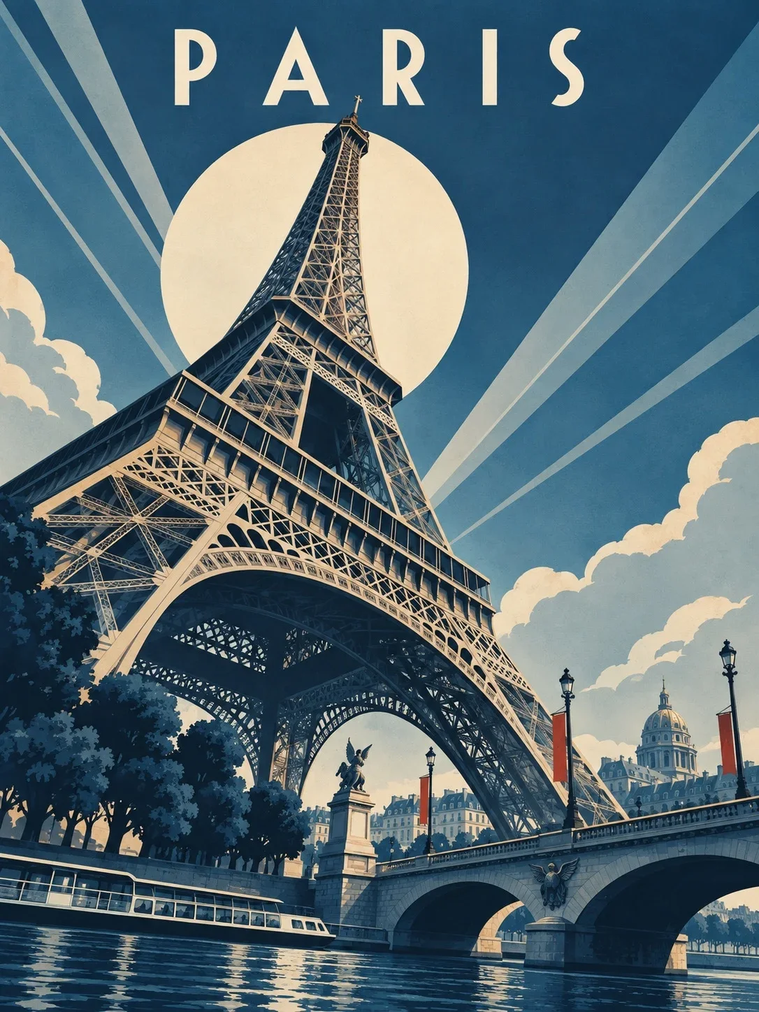
The travel posters of the 1920s and 1930s, especially for ocean liners and railways, are the most recognizable style. Look for geometric simplification, smooth airbrushed gradients in the sky, dramatic low viewpoints that make ships and towers monumental, strong diagonals and tall condensed lettering. The mood is luxury and speed.
The Art Deco travel poster used as this guide's cover demonstrates the key moves: a monumental landmark, a strong diagonal from lower left to upper right and the upper third reserved for sky and title. Notice how much of that prompt is layout rather than style.

Mid-century screen print
From the 1950s and 1960s, travel posters became flatter and more playful, often screen printed with a few inks. Each color was a separate layer, so shapes are flat, edges are crisp and colors sometimes overlap slightly, creating a third tone where they meet. Write screen print look, four flat inks, slight misregistration, paper texture to get that handmade print character.
Cutout and collage
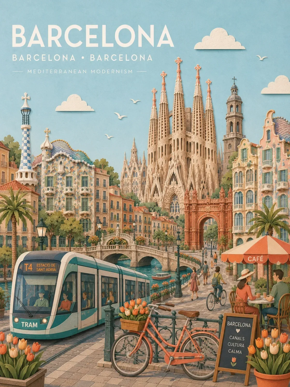
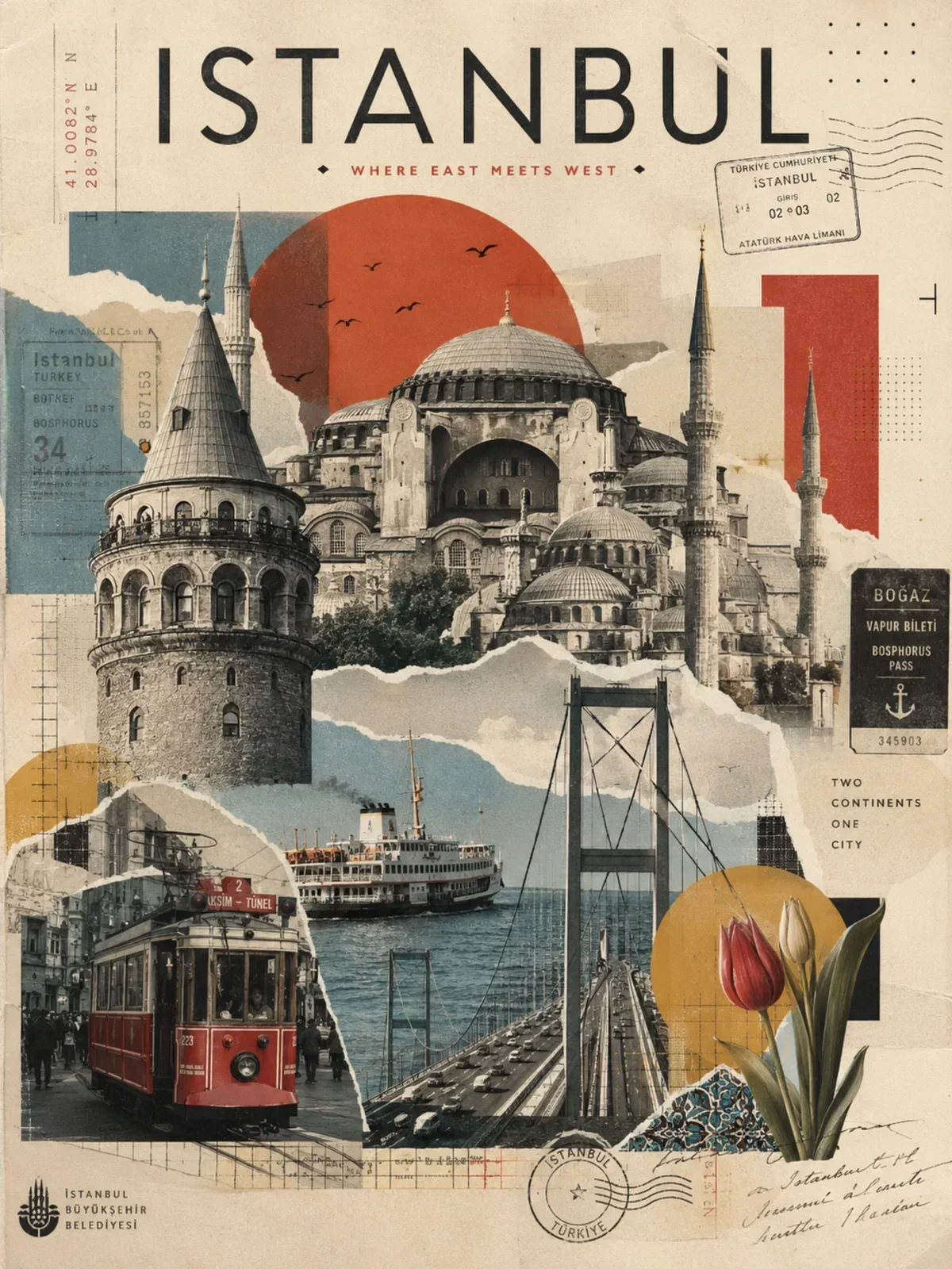
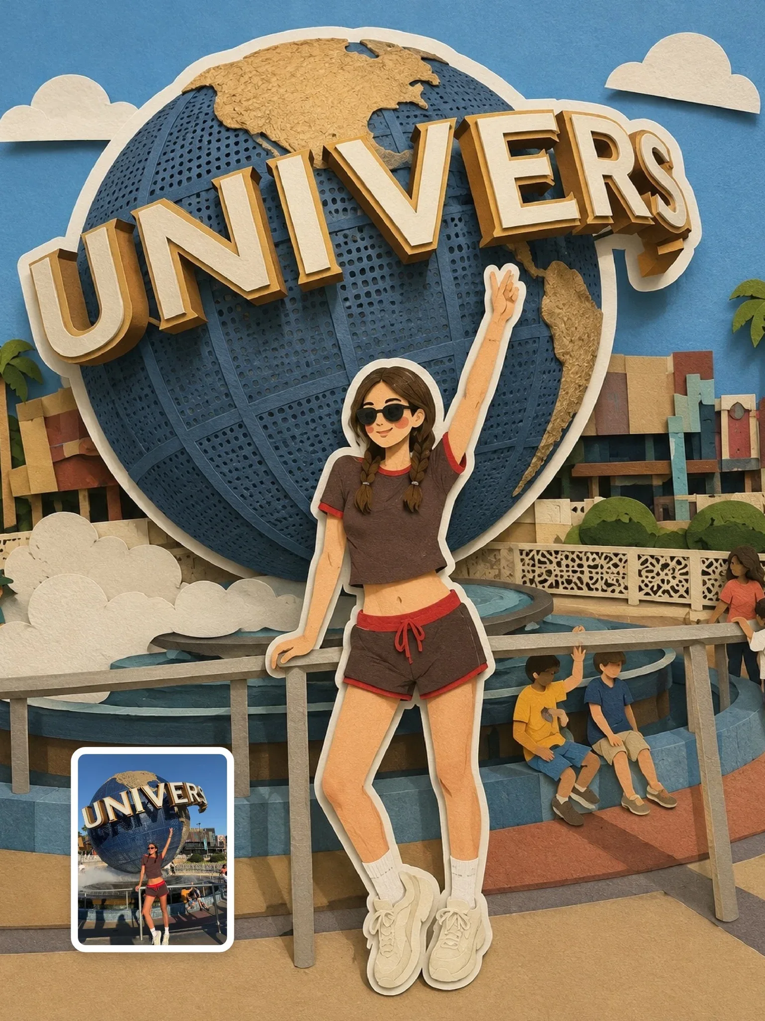
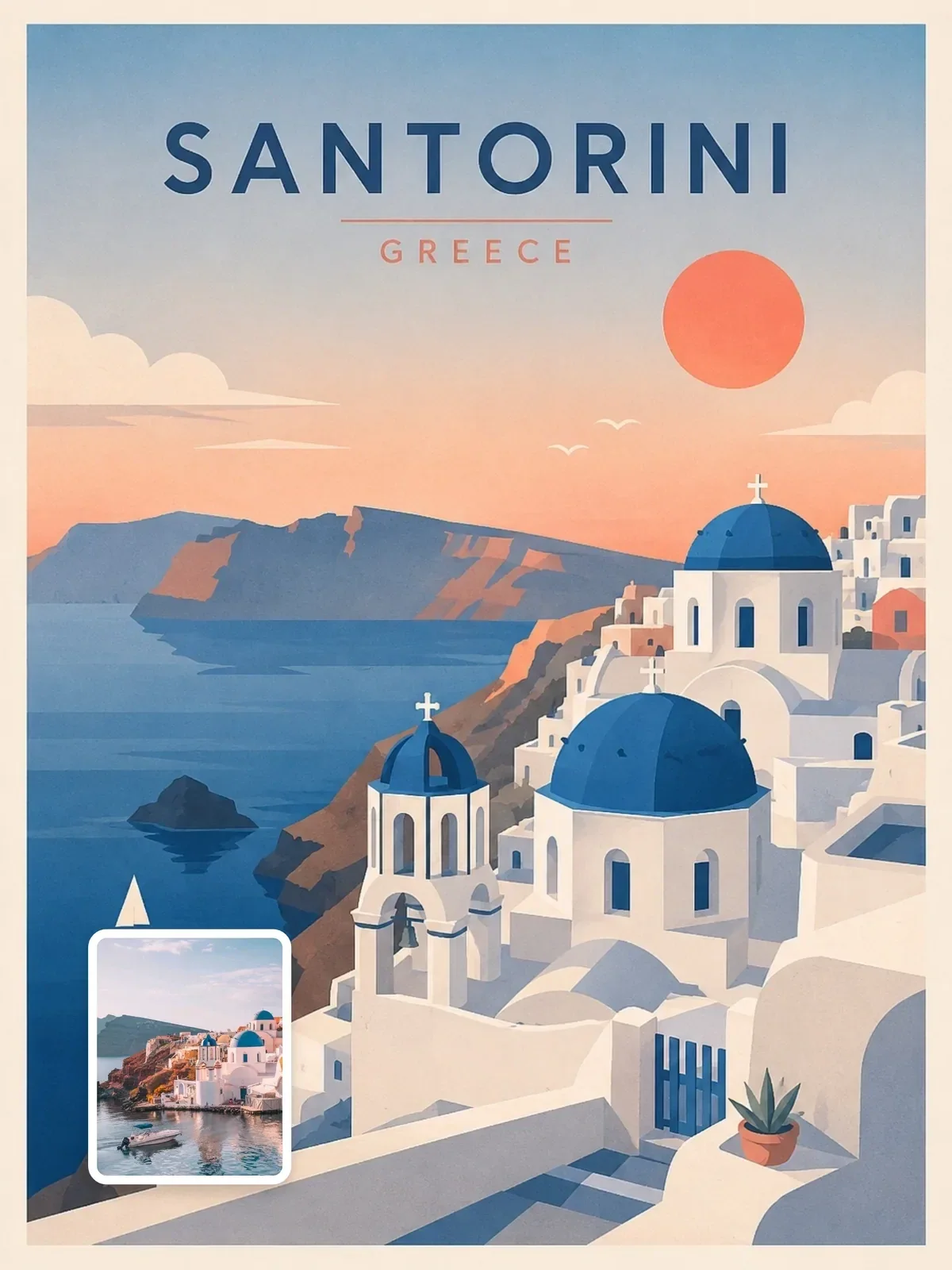
A contemporary favorite builds the city from layers of paper or from cut-up vintage imagery. Layered cutouts feel calm and Scandinavian, with clear foreground, midground and background bands. Collage feels surreal and editorial, combining a landmark with unexpected scale shifts, halftone textures and torn edges. Compare the restrained layered-cutout poster below with the bolder surreal collage city poster to see how far apart they sit. For more on building paper layers, see paper cutout illustration.
Lay out the poster before choosing a style
Professional poster designers block out zones before drawing anything. Doing the same in your prompt gives the model a structure that survives any style you apply on top. A vertical poster typically divides into four zones from top to bottom.
- Sky and title zone (top 20 to 30 percent): calm color or gradient, room for the city name.
- Hero zone (middle): the landmark or scene, the largest and most detailed element.
- Foreground frame: a palm leaf, railing, boat bow or tree branch that adds depth and leads the eye in.
- Footer band (bottom 10 to 15 percent): a solid color strip for a subtitle, a country name or a small motif.
Beautiful travel poster of Lisbon with trams, the river, the castle, sunset, people, birds and the city name.
Vertical mid-century travel poster of Lisbon. Top quarter: flat warm cream sky reserved for the title. Middle: a single yellow tram climbing a steep street toward the castle, seen from a low angle. Foreground: a wrought-iron balcony rail on the left. Bottom band: solid terracotta strip. Five flat inks, screen print texture.
The planned version drops the river, the birds and the crowds. That is not a loss; it is the design decision that makes the poster read instantly. You can save the river for a second poster in the same series.
Choose a palette that belongs to the place
The strongest posters take their colors from the destination itself. Think of the materials, light and signage you would actually see there, then pick four to six of them. A palette tied to the place feels authentic; a generic sunset gradient could be anywhere.
- Mediterranean harbor: whitewash, ultramarine, terracotta, olive green, sun yellow.
- Northern city in winter: slate blue, snow white, brick red, warm window amber.
- Desert town: sand, rust, deep teal shadow, pale turquoise sky.
- Tropical coast: coral, palm green, turquoise water, warm cream.
Pastel versions of these palettes give a softer, gift-shop feel, as in the pastel paper-collage city poster listed at the end of this guide. For a deeper method of describing color, read color grading in prompts.
Repeat each color at least twice in different parts of the poster. A red roof echoed in a red footer band ties the design together; a color used only once looks like a mistake.
Type: ask for less, check everything
Text is the part of a poster most likely to go wrong. Image models handle a short, prominent word far better than several lines of small type. Keep the title to the city name, plus at most one short subtitle, and describe its style in poster terms: tall condensed Art Deco capitals, rounded bold sans-serif, hand-lettered brush script.
Always zoom in and check spelling, accents and letter spacing. Names with accents or uncommon letter combinations are the usual trouble spots. If the title keeps failing, generate the poster with an empty title zone and set the type yourself in any design app; many designers would do it that way anyway. Getting clean text in AI images covers the techniques in detail.
Make it a series with variables
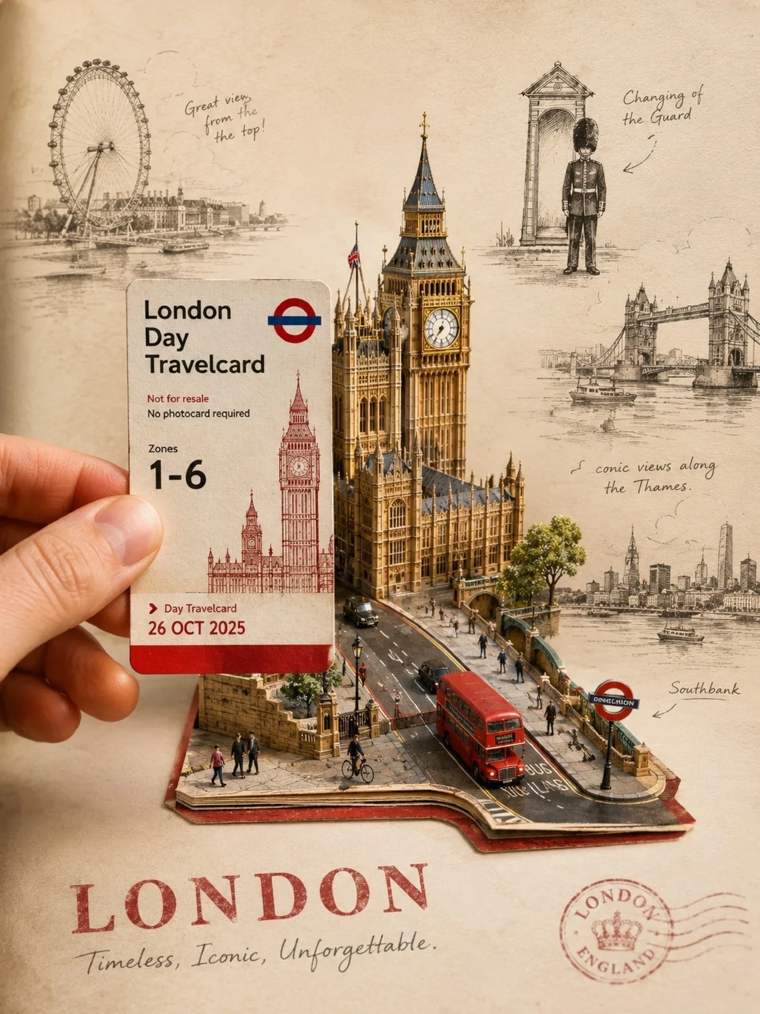
Travel posters are natural series: one per city on a trip, or one per season in your hometown. Once you have a layout and style you like, turn the changing parts into variables. The travel poster prompt does exactly this with fields for the city, travel card, hero landmark, main vehicle, doodle elements and accent color.
Keep the layout, era, ink count and type style fixed, and change only the place-specific fields. The result is a set that hangs together on a wall. The method is explained in prompt templates and variables.
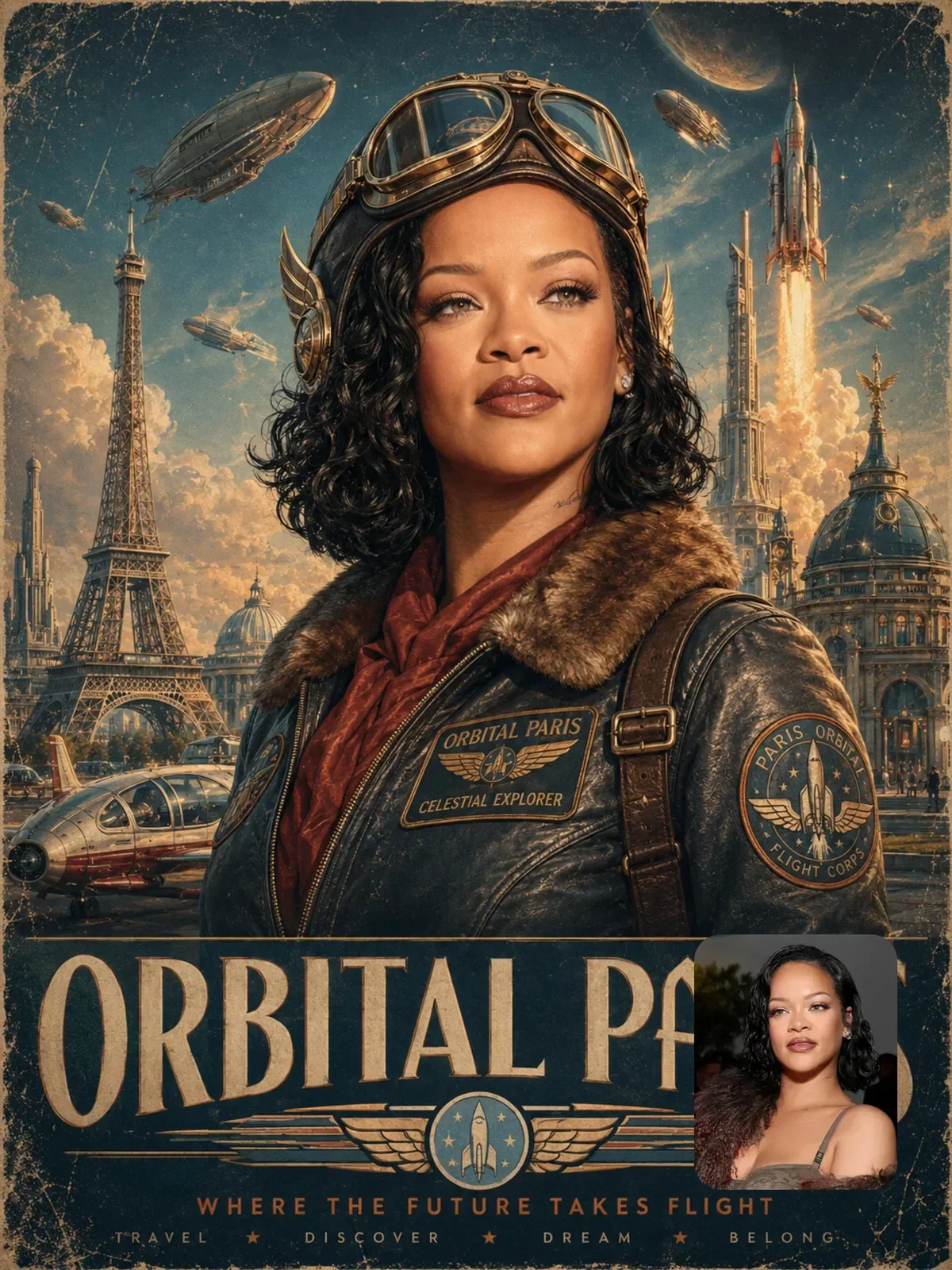
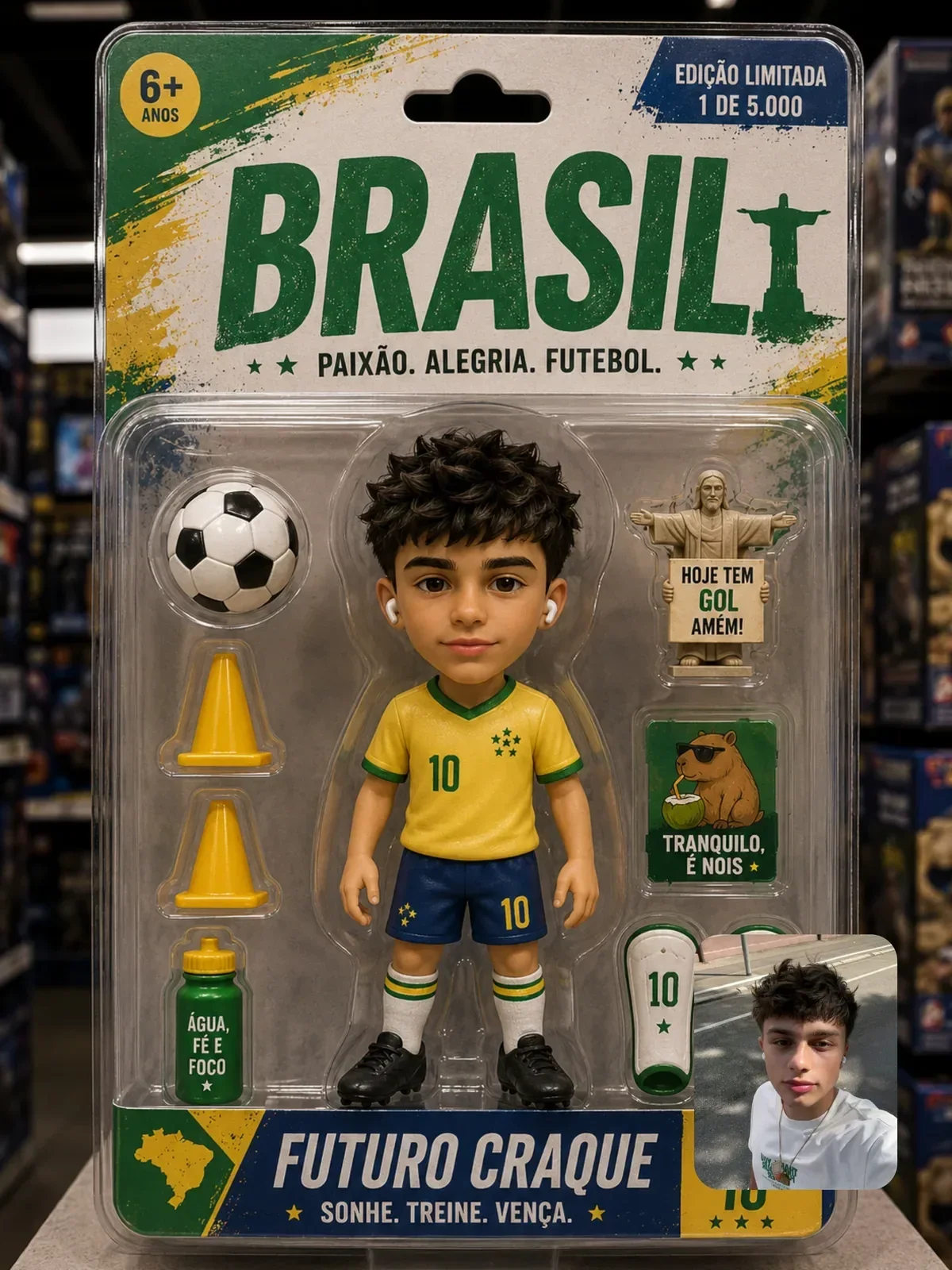
You can also put yourself in the poster. The retro-futuristic aviation poster uses an uploaded photo as the hero figure in a vintage exploration campaign. Use your own photo, or one of a travel companion who is happy to appear.
Getting it onto a wall
Common poster and frame sizes use different proportions, so decide on the frame before you generate. Cropping a finished poster to a new ratio often cuts into the title or the landmark.
| Print size | Ratio | Prompt as |
|---|---|---|
| 30 x 40 cm or 12 x 16 in | 3:4 | Vertical 3:4 |
| 18 x 24 in | 3:4 | Vertical 3:4 |
| 24 x 36 in | 2:3 | Vertical 2:3 |
| 50 x 70 cm | 5:7 | Vertical 2:3, leaving extra margin to crop |
| A4, A3, A2 | about 1:1.41 | Vertical 2:3 or 3:4 with generous margins |
Prints look sharpest at around 300 pixels per inch, but posters are viewed from a distance, so 150 to 200 is often acceptable for larger sizes. AI images usually need upscaling for anything bigger than A4. Flat-color poster styles upscale more cleanly than detailed photographic ones, which is one more reason to keep the design simple. Choosing the format before you start saves you from awkward crops later.
Your poster brief
Before your next poster, answer these six questions in a single line each, then turn the answers into your prompt in this order:
- Which tradition: Art Deco, mid-century screen print, layered cutout or collage?
- What is the single hero element?
- What sits in the foreground frame?
- Which four to six colors come from the place itself?
- What is the exact title, and in what lettering style?
- Which print size and ratio will it hang at?
Make the same city in two traditions with an identical brief except for line one. The comparison will show you how much of a poster's character comes from layout and palette, and how little from the style label alone.