Black and White Portraits: Contrast, Tone and Mood
Prompt black and white portraits with real tonal control: high-key and low-key looks, contrast, color filters, grain and print finish, and fixes for flat gray.
Visual AI Club6 Min. Lesezeit
Dieser Ratgeber ist auf Englisch geschrieben.
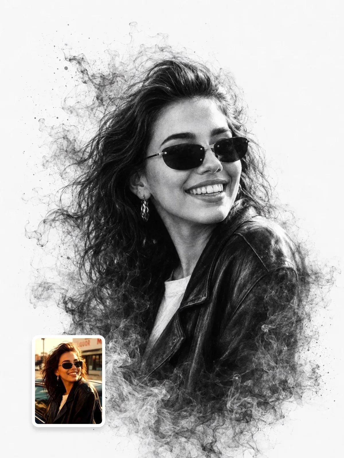
Most black and white AI portraits come out a uniform mid-gray, as if someone desaturated a color photo and stopped there. By the end of this guide you will be able to ask for a specific tonal key, a contrast level and a print finish, and get portraits with deep blacks, clean whites and a clear mood.
Think in tones, not in missing color
In color, a red scarf separates from a green wall by hue alone. Strip the color away and both may land on the same gray, merging into one flat shape. Black and white photographers therefore plan in brightness: which parts of the frame should be near white, which near black, and where the face sits between them.
A helpful way to describe this is the tonal key. A high-key portrait lives mostly in light grays and whites with a few dark accents, usually the eyes and hair. A low-key portrait lives mostly in dark tones, with light falling on part of the face. A full-range portrait uses everything from pure black to pure white, which is the classic documentary look. Naming the key is the fastest way to stop the gray-soup result.
Black and white portrait of an older man with a beard.
Low-key black and white portrait of an older man with a silver beard against a near-black background. A single soft light from the left catches his cheekbone, beard texture and one eye; the far side of his face falls into deep shadow. Rich blacks, bright specular highlights in the eyes, fine grain.
Three portrait looks worth learning
High-key and airy
A white or very pale background, soft wraparound light and low shadow density. Skin reads light and smooth, dark eyes and hair become the strongest marks in the frame. This suits children, fashion, beauty and anything that should feel calm. The monochrome fine-art portrait uses a clean white background with generous negative space, which is a textbook high-key setup.

Low-key and sculpted
A dark background and a single light source placed to the side or slightly behind. The shape of the face comes from where the light stops. Older faces, textured skin, beards and strong features look powerful here. Lighting patterns matter a lot in this style; Rembrandt and split light are the usual choices, both covered in studio lighting setups.
Gritty documentary
Available light, ISO 400 or faster film, visible grain, full tonal range and a moment that feels caught rather than posed. A 35mm lens at chest height puts the viewer close to the subject. This look forgives imperfect skin and messy backgrounds, because texture is part of the point.
Write the key at the start of the prompt, not the end. Low-key black and white portrait of frames everything that follows, while a trailing black and white is often treated as an afterthought.
Contrast is a choice you have to state
Contrast is the distance between the darkest and lightest tones, and how quickly the image moves between them. Low contrast feels soft, nostalgic and gentle. High contrast feels graphic, dramatic and tense. Image models default to a cautious middle, so state the level and back it up with a lighting reason.
- Soft contrast: overcast daylight, large window,
gentle gradations, open shadows, no pure black. - Medium contrast: one soft key and a reflector,
full tonal range, detailed shadows. - Hard contrast: small hard light or direct sun,
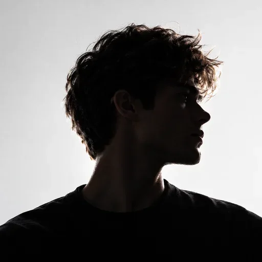
deep inky blacks, bright highlights, crisp shadow edges. - Graphic: near silhouette or rim light,
bold black shapes, minimal midtones.
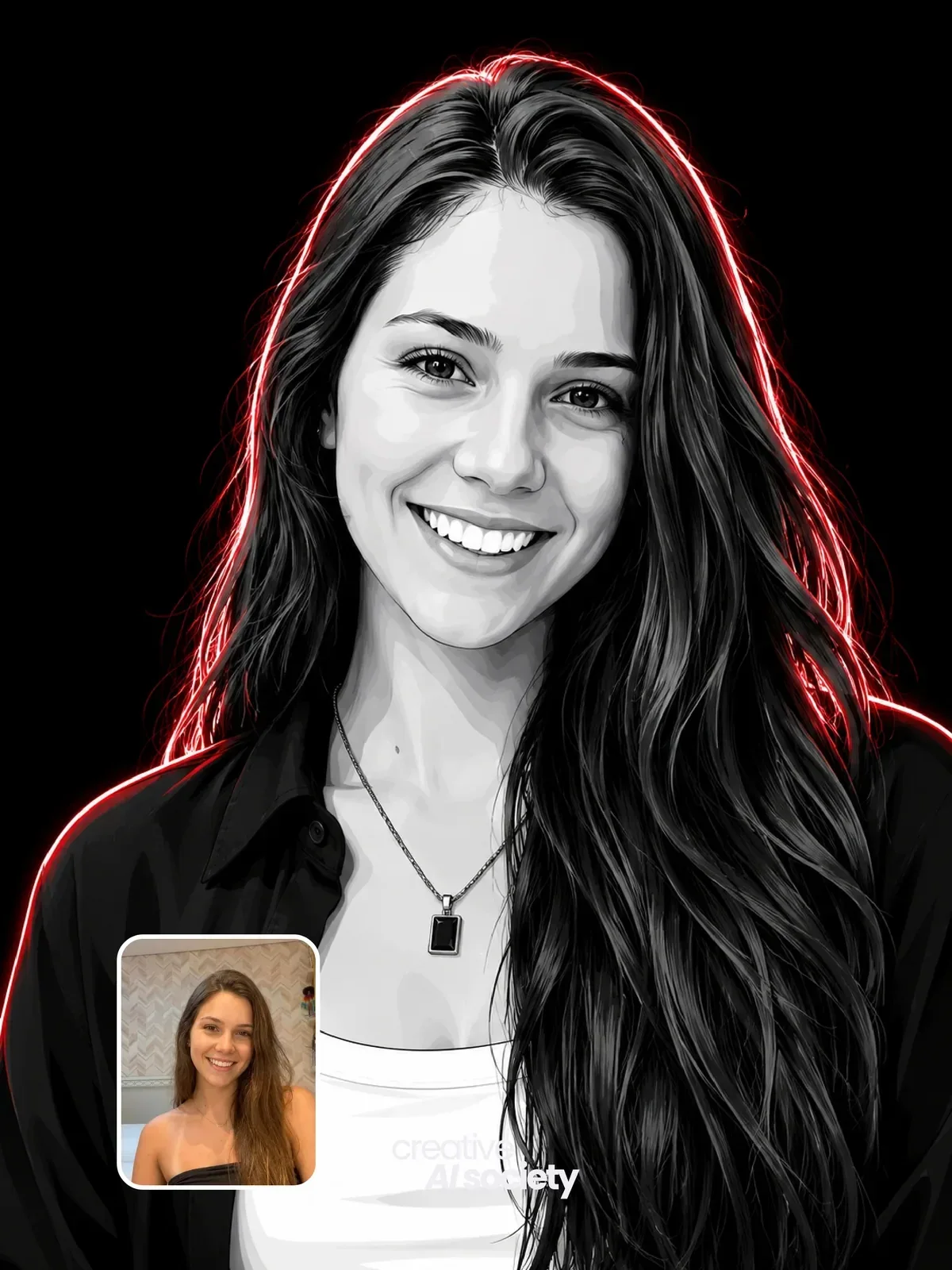
Hard contrast and hard light belong together. If you ask for crushing contrast but describe a huge diffused light, the model gets mixed signals and splits the difference. For the extreme end, where photography turns into flat black shapes, compare the high-contrast monochrome vector portrait, which deliberately removes midtones altogether.
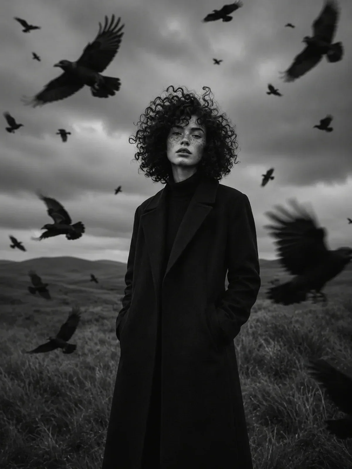
Contrast also works across a whole scene, not just a face. In a wide editorial frame, a dark figure against a pale, misty landscape reads instantly even when the person is small. The monochrome dark fashion landscape editorial builds its mood this way: a clean silhouette, open negative space above the subject and dark shapes moving through a light sky.
Borrow the old trick of color filters
Film photographers shooting black and white screwed colored filters onto the lens to control how colors turned into grays. A filter lightens its own color and darkens its opposite. The effects are well known, and they make useful prompt vocabulary because they describe a specific tonal shift.
- Yellow filter: slightly darker blue sky, natural skin. A mild everyday choice.
- Orange filter: clearly darker sky, smoother skin with blemishes softened.
- Red filter: very dark, dramatic sky, bright clouds, pale and smooth skin, lips lighter.
- Green filter: foliage lighter, skin and lips slightly darker, often used to give male portraits a more weathered tone.
Black and white outdoor portrait of a woman on a hilltop at midday, shot through a red filter: the sky almost black, white clouds glowing, her skin pale and smooth, wind in her hair. 50mm lens, high contrast, fine grain.
You can also describe the result directly, such as dark dramatic sky, luminous clouds, but naming the filter helps the model understand why the sky and skin behave the way they do.
Light direction carries the mood
Without color to guide the eye, the brightest area of the frame becomes the center of attention. That makes the position of the light far more important than in color. Light from the front flattens a face and makes it read younger and softer. Light from the side reveals texture and age. Light from behind outlines the head and shoulders and hides the expression.
Background brightness should usually oppose the subject. A dark-haired person in dark clothes separates from a light gray backdrop; a pale subject in white separates from black. When the subject and background share a tone, add a rim light or a little background glow behind the head. The cinematic white studio shows how a strong backlight creates a bright outline that separates a figure from a white environment.
Grain, paper and toning
The last layer of a black and white portrait is its finish. A clean digital monochrome looks modern and precise. Film grain adds texture and age. Print descriptions add a physical object quality that can make an image feel like it belongs on a gallery wall.
silver gelatin print: deep blacks, slight sheen, classic darkroom feel.matte fiber paper: softer blacks, velvety surface, fine art mood.subtle selenium tone: cool, slightly purple-black shadows, still reads as neutral.warm-tone paper: very slight warm cast in highlights, gentle and nostalgic.
Use toning words carefully. Sepia will push the whole image brown, which is a different look from neutral black and white. If you want strictly neutral grays, say true neutral black and white, no color tint. The film looks guide goes deeper into grain sizes if you want an analog texture.
Questions people ask about monochrome prompts
Why does my portrait still have a faint color cast?
Words like vintage, cinematic or moody often bring a warm or teal tint with them. Remove them or add neutral grayscale, no tint. When editing your own photo, ask the model to convert to monochrome as the first instruction rather than the last.
Why do the eyes look dull?
Eyes come alive from catchlights, the tiny reflections of the light source. Ask for clear catchlights in both eyes and place the light high enough to create them, around 45 degrees above eye level.
Will the person still look like themselves?
Black and white removes skin tone and eye color cues, so identity relies more on shape and features. Keep the face angle close to your reference and avoid extreme stylization if likeness matters. Use only photos of yourself or of people who agreed to be photographed; keeping a person recognizable covers the details.
Your monochrome practice set
Pick one portrait reference you have permission to use and make three versions in one sitting. Keep the subject and framing identical, and change only the tonal recipe.
- High-key: white background, soft frontal light, low contrast, no grain.
- Low-key: black background, single side light, deep shadows, fine grain.
- Documentary: natural window light, full tonal range, ISO 400 grain, slight imperfection in framing.
Put the three side by side and ask which one matches the person. Most faces clearly suit one key over the others, and finding that match is the real skill of black and white portraiture.