Minimalist Editorial Illustration: Saying More With Less
Create minimalist editorial illustrations with AI: find one visual idea, limit the palette, use negative space and stop models from adding clutter.
Visual AI Club7 dk okuma
Bu rehber İngilizce yazılmıştır.
Think of the small drawing next to a newspaper opinion column: a figure, an object, a lot of white space, and an idea you get in two seconds. That is editorial illustration, and its minimal version is harder to prompt than it looks, because image models love to add detail.
This guide covers how to find the idea first, then how to hold the model to a short palette, a small figure and an empty page.
The idea comes before the style
Editorial illustrators are hired to make a concept visible: burnout, a housing shortage, a long-distance friendship. The drawing style is secondary. A minimal illustration with a clever idea beats a detailed one with an obvious idea every time.
Most weak prompts in this style describe a person and a setting. Strong ones describe a visual metaphor: one image that stands for the topic. The simplest way to find one is a quick word list.
- Write the topic in three words, for example: too many notifications.
- List ten objects connected to it: phone, bell, envelope, red dot, alarm clock, speech bubble.
- List five feelings: buried, pulled, interrupted, small, tired.
- Combine one object with one feeling in a physical way: a person buried under a pile of tiny red dots, a figure pulled by strings tied to speech bubbles.
- Pick the combination you could explain in one sentence to a child.
Your first three ideas will be the obvious ones. Keep going; the fourth or fifth is usually where the interesting image is.
Here is the process run once. Topic: saving money. Objects: piggy bank, jar, coins, wallet, receipt, calendar. Feelings: patient, careful, tempted. The obvious image is a person dropping a coin into a piggy bank. A better one: a person watering a tiny plant growing out of a coin jar, which says patience. Better still, perhaps: a person holding a ladder steady while a single coin climbs it. Each step moves from showing the topic to showing how it feels.
One figure, small, with room to breathe
Negative space is the empty area around the subject, and in minimalist work it is not leftover space. It is part of the message: a tiny figure on a big page feels alone or overwhelmed; a figure filling the frame feels confident or trapped. Decide what the emptiness means.
Models tend to make the subject large and centered and then fill the corners. Give a number instead. Saying the figure occupies about 20 to 30 percent of the canvas is far more effective than saying lots of white space. Also say where it sits: lower third, off to the left, on a single horizon line.
Ask for one ground element at most: a single line for the floor, or a soft shadow. Without anything under the figure, models often invent a full room.
Layout matters because editorial images sit next to text. If you know the image will run beside a headline, leave space for it, for example: empty upper half for a headline. For more on placing subjects, see composition for AI images.
A short palette does most of the work
Minimal editorial illustration usually uses two or three colors plus the paper. That restraint is a design decision with practical roots: printed newspapers and magazines have long favored simple, limited colors because they reproduce cleanly and hold up at small sizes.
- Black and white only: sharpest, most graphic, very old-school editorial.
- Black plus one accent: a red, an orange or a cobalt used only on the key object. The accent tells the viewer where the idea is.
- Two muted colors on cream paper: warm and calm, common in contemporary illustration.
- Tonal: several shades of one hue, good for quiet subjects.
Name the colors precisely and say what may not appear. Hex codes are understood by most image models as a guide, though they will not match exactly, so pair them with a plain name: deep tomato red (#D2442F) used only on the umbrella.
The paper is a color too. Pure white feels digital and clinical; warm off-white or cream feels printed and handmade; a pale gray or pale blue ground gives a cooler, more corporate tone. Choose it as carefully as the ink.
A minimalist illustration about loneliness in the city.
Minimalist editorial illustration on warm off-white paper. A single small figure sits on the edge of a giant empty chair, the figure about 15 percent of the canvas, lower left. Black ink line and flat shapes only, one accent color, deep tomato red, used on the figure's scarf. No background, no other objects, no text.

Shapes and lines: decide the drawing language
Minimal does not mean one style. There are several drawing languages, and choosing one keeps the result coherent.
Flat shape
Figures built from solid areas of color with no outlines and no gradients. Faces are often reduced to a few shapes or left blank. This style depends on a strong silhouette, so the pose must be readable as a shadow.
Single-weight line
A thin, even line, like a fine-liner pen, describing contours only. Ask for a uniform line weight and no hatching or shading. It looks calm and modern, and it pairs well with one flat accent shape behind it.
Naive and handmade
Slightly wobbly shapes, uneven proportions, visible paper or gouache texture. It feels personal and warm. The trick is to ask for intentional simplicity, otherwise the model may read naive as sloppy. If you like cut and layered paper, the paper cutout illustration guide covers that look in depth.
Stopping the model from adding things
Image models are trained on an enormous number of detailed images, and when in doubt they fill space. In minimalist work you have to say clearly what is absent, and repeat the key limits in more than one way.
- Say what the background is: plain off-white paper, nothing else.
- List banned elements: no gradients, no texture on the figure, no extra objects, no text, no frame.
- Give the count: one figure, one object.
- State the size as a percentage of the canvas.
- Remove words that invite detail, such as intricate, highly detailed, cinematic, 8K.
There is more on phrasing these limits in constraints and negative instructions. One useful habit: if a result has an unwanted object, do not just add no plants. Ask yourself why the model thought it needed one. Often the figure has nothing to do or nowhere to stand, and giving it a simple action removes the urge to decorate.
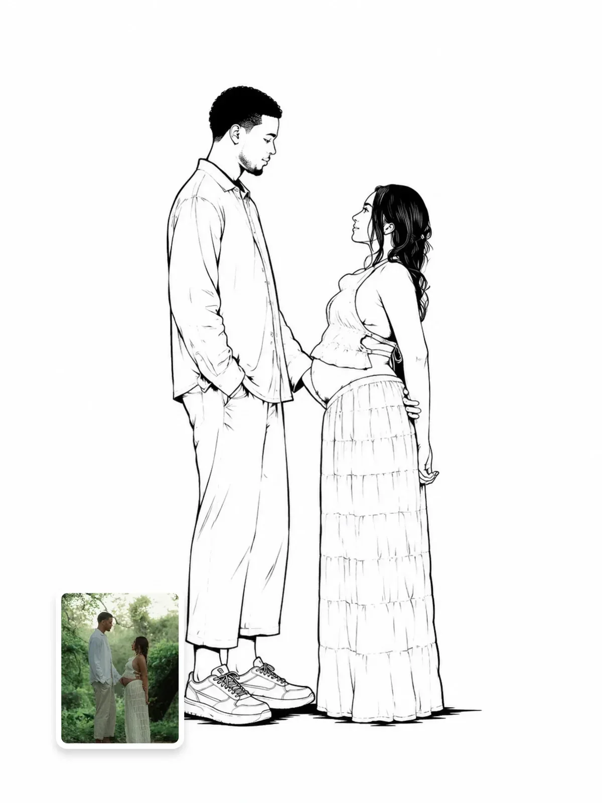
Using your own photo as the starting point
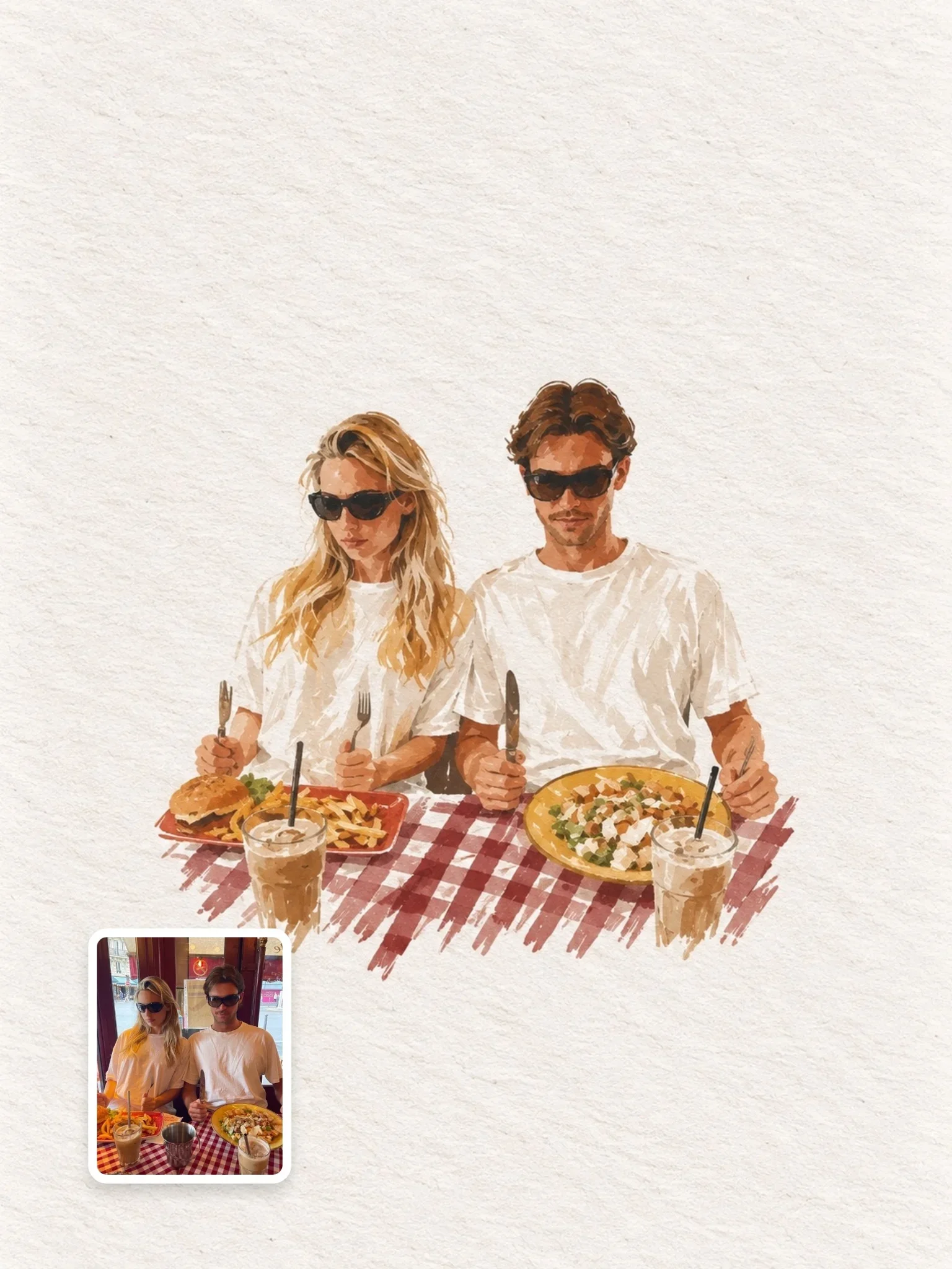
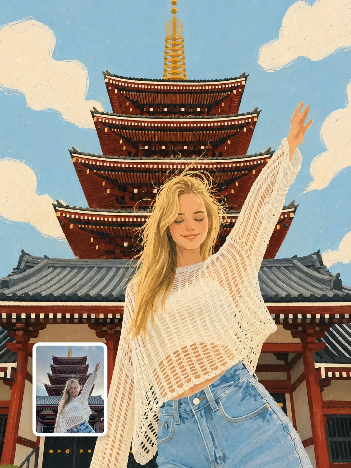
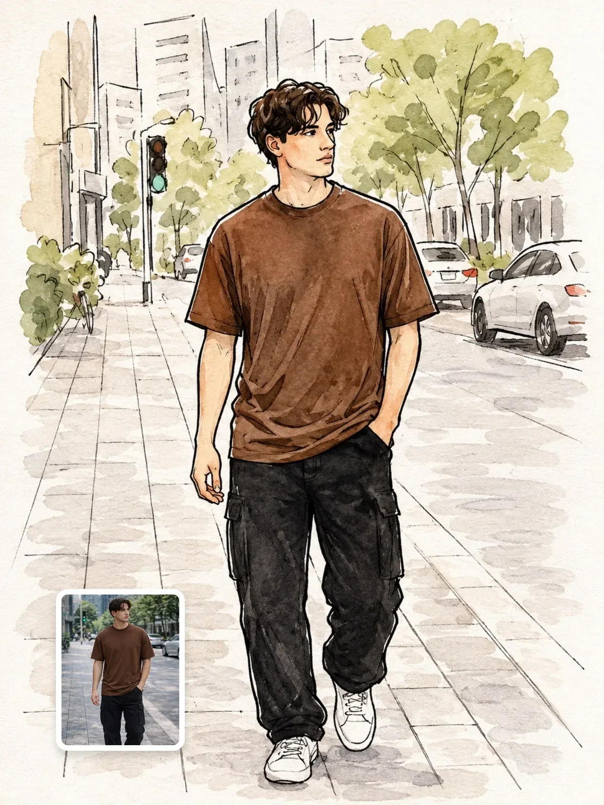
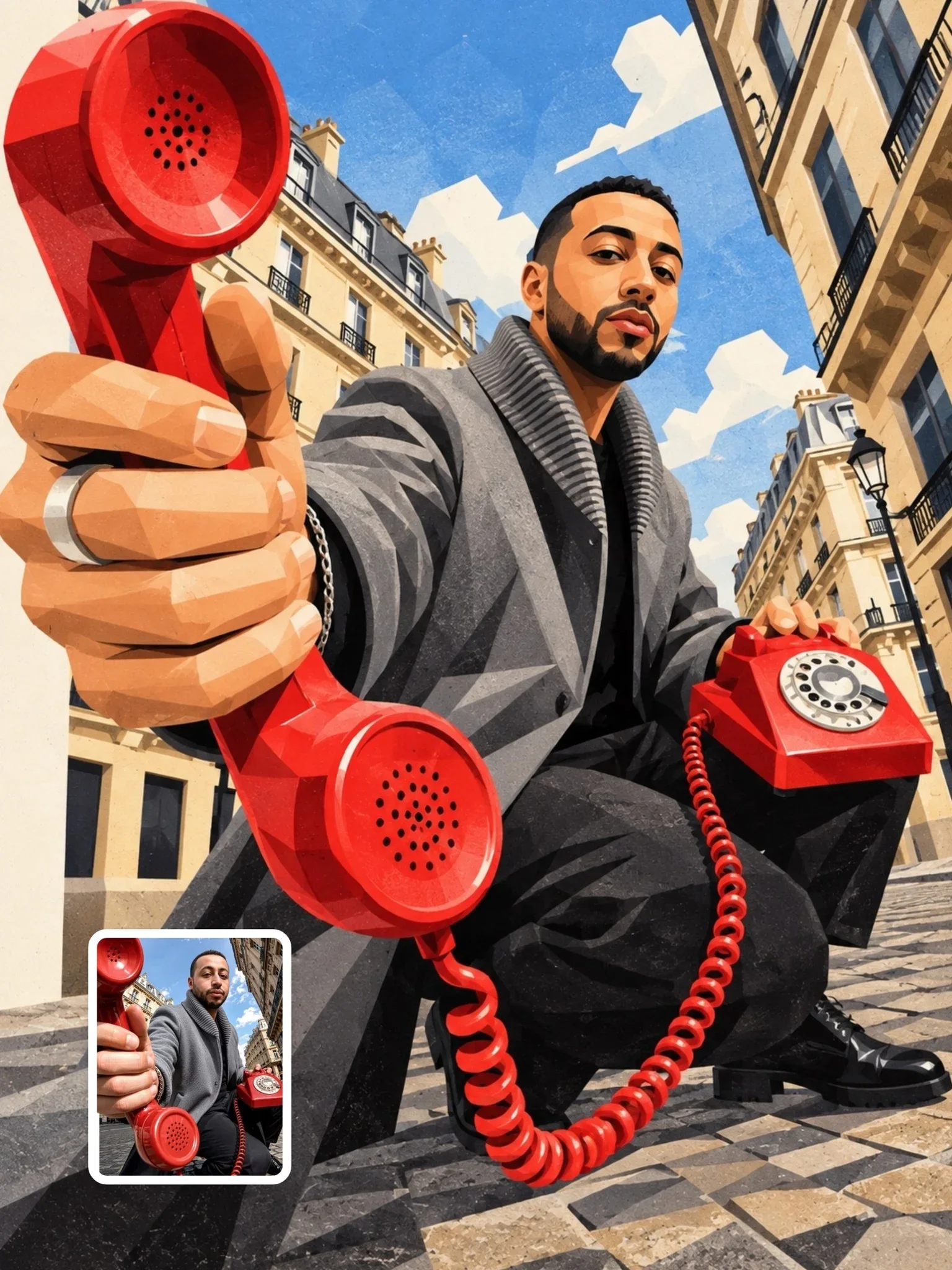
Turning a portrait into a minimal editorial illustration is a popular use, and it works best when the photo already has a clear pose and a simple background. A busy street photo will pull clutter into the drawing.
Tell the model which details carry the likeness, such as hairstyle, glasses and a coat, and allow it to simplify everything else. Minimalism and likeness pull against each other, so keep the face slightly more detailed than the body. Only use your own photo or one the person agreed to.
Expect to run a few versions. Minimal images have nowhere to hide, so small changes matter more: the angle of a head, the gap between two figures, the exact size of the accent shape. Compare results side by side and pick the one where the idea reads fastest, not the one with the nicest drawing. In editorial work, clarity is the quality that counts.
Check it at thumbnail size
Editorial illustrations are often seen small: in a news feed, beside a headline, on a phone. A minimal image has to survive that. After generating, shrink it to about 200 pixels wide, or step back from the screen, and look again.
- Can you still read the pose and the key object?
- Does the accent color still point to the idea?
- Do thin lines disappear? If so, ask for a slightly heavier line weight.
- Does the negative space still look intentional, or just empty?
If the image fails at small size, simplify further rather than adding detail. Remove a secondary object, enlarge the figure a little, or make the silhouette clearer. For the general prompt structure underneath all of this, see how to write image prompts.
Practice: three headlines, three images
Write three made-up headlines, such as Why We Never Finish Our Books, The Quiet Cost of Working From Bed, Learning to Swim at Forty. For each one:
- Do the ten objects and five feelings list, and pick one metaphor.
- Choose a drawing language: flat shape, single-weight line or naive.
- Fix the palette at black plus one accent.
- Set the figure size and position, and leave space for the headline.
- Generate, then cover the headline with your hand and ask a friend what the image is about.
If they guess the topic, or something close to it, your metaphor works. If they describe only what they see, the image is decoration; go back to the word list and try a stranger combination.