Doodles on Real Photos: The Mixed-Media Trend Explained
Prompt hand-drawn doodles on real photos: pen overlays, doodle people in real places and ink twins, with advice on pens, placement and locking the photo.
Visual AI Club6 min read
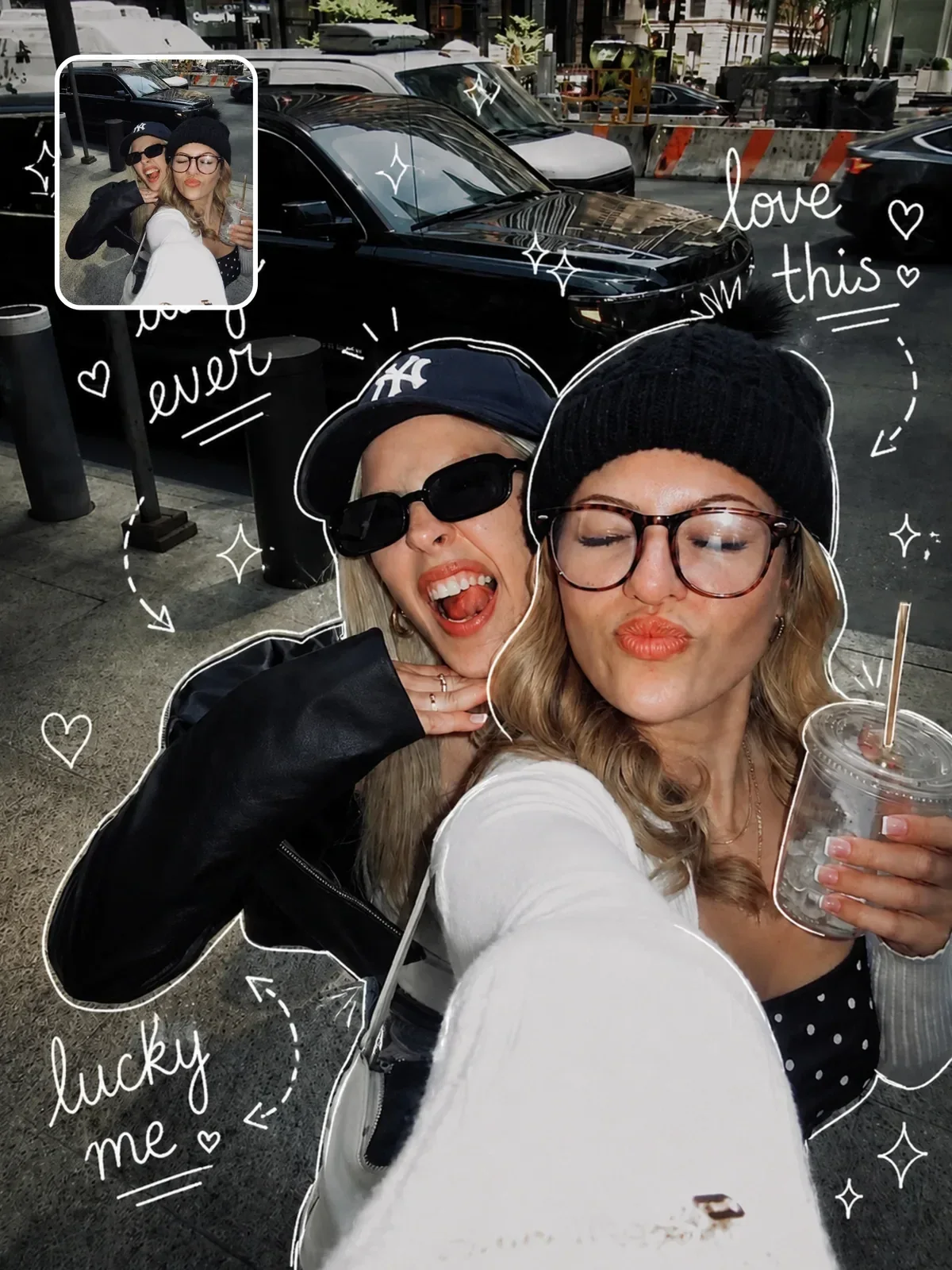
Picture an ordinary holiday photo with a white gel-pen crown drawn over someone's head, little sparkles around a coffee cup and a wobbly arrow pointing at the sunset. That collision of a real photograph and a quick hand drawing is the whole appeal of the doodle trend. In this guide you will learn the three main versions of the look and how to prompt each one without the model repainting your photo.
Three versions of the same idea
People use the word doodle for quite different images, and each needs a different instruction. Decide which one you want before you write anything.
1. Doodles drawn on top of the photo
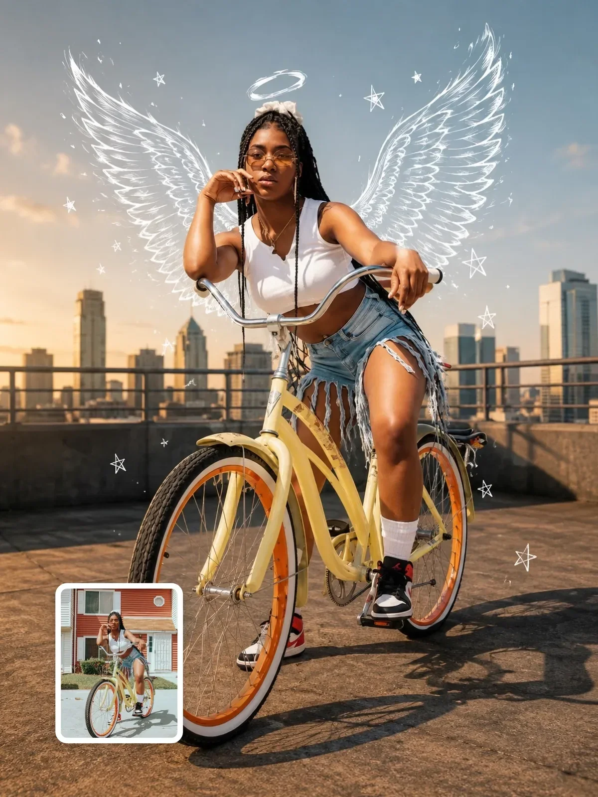
The photograph stays completely untouched, and thin hand-drawn lines are added over it: outlines tracing a person, stars, hearts, arrows, small notes. It looks like someone grabbed a pen and scribbled on a printed photo. The hand-drawn doodle overlay is a clean example of this approach, with a variable for the line color.
2. People become doodles, the world stays real
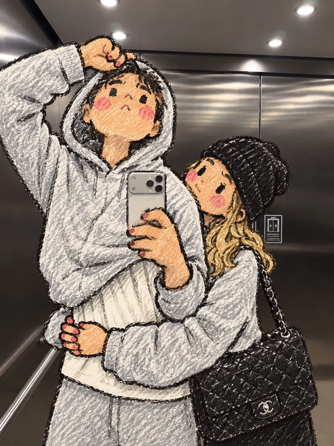
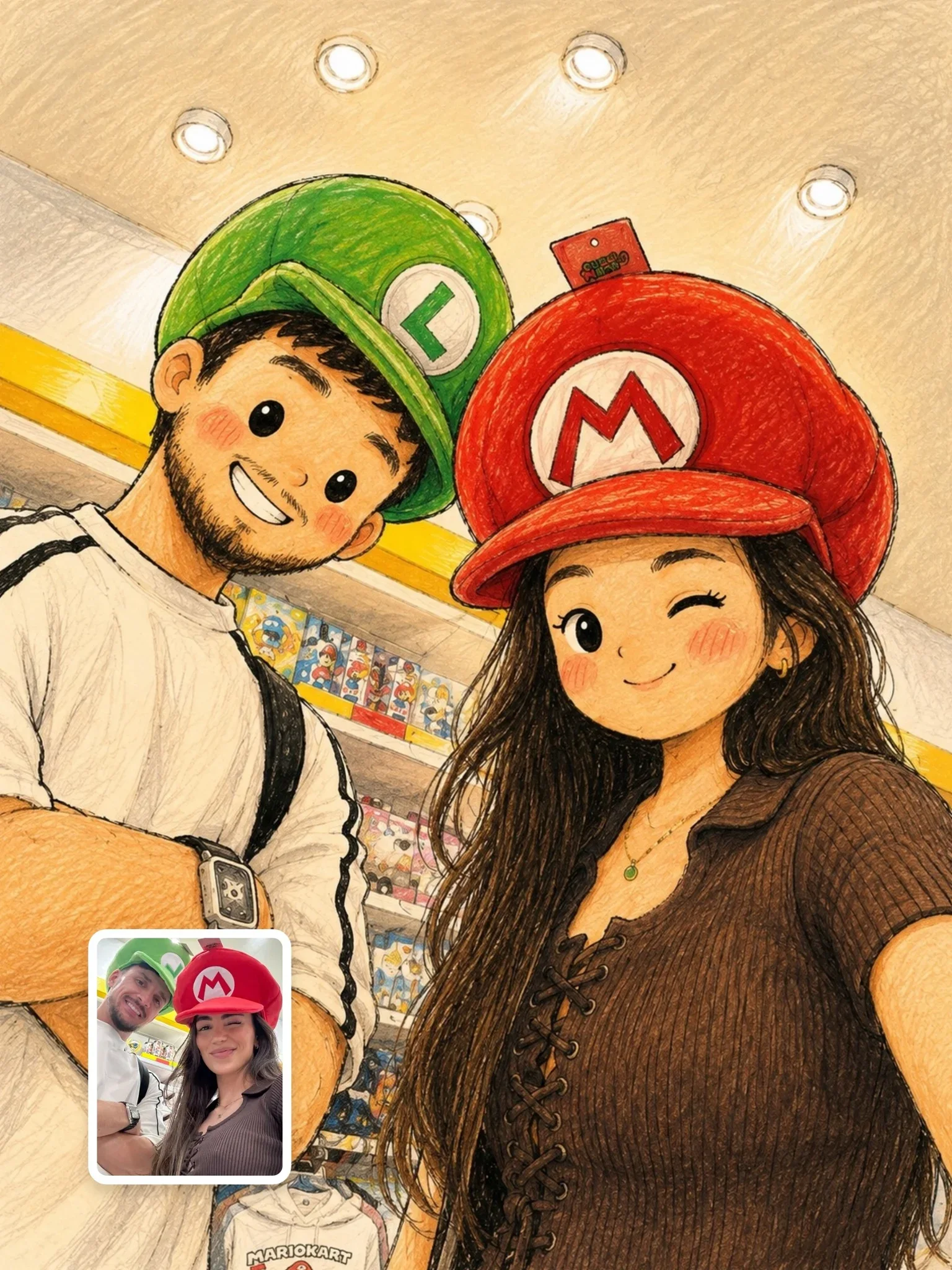
Here the people are redrawn as simple cartoon or crayon characters, while the background, light and objects remain photographic. The effect is funny and a little magical, like a children's drawing that walked into a real street. Doodle Me uses crayon characters; the storybook doodle version uses softer, rounder ink figures.
3. A doodle companion beside the real person
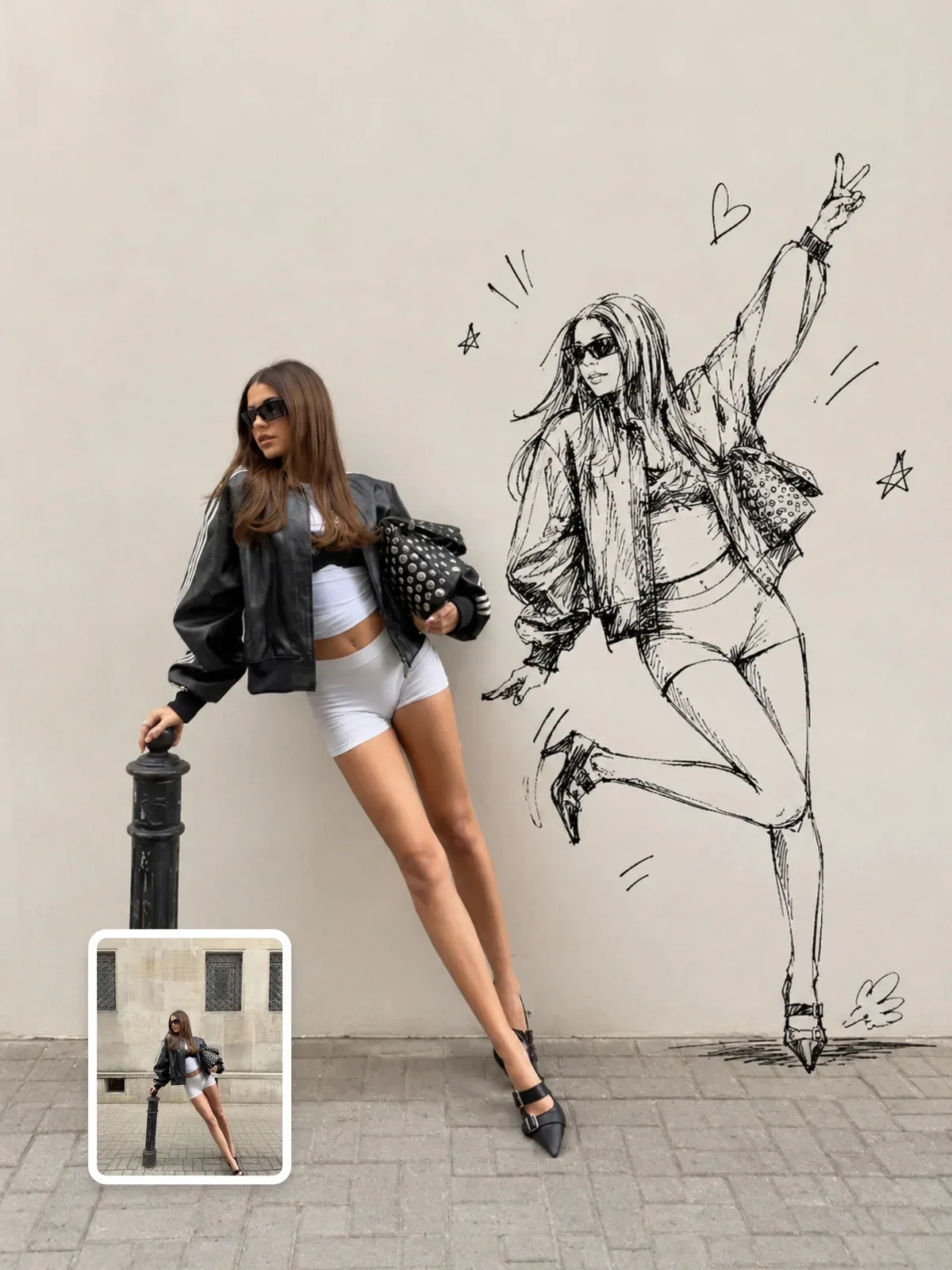
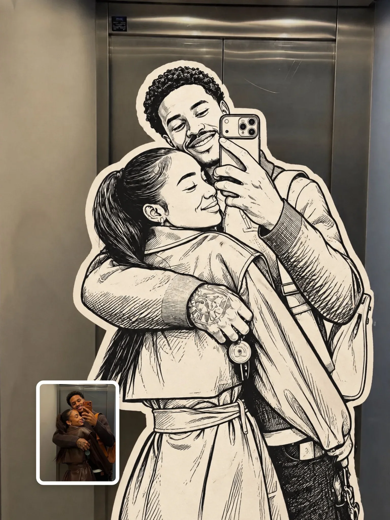
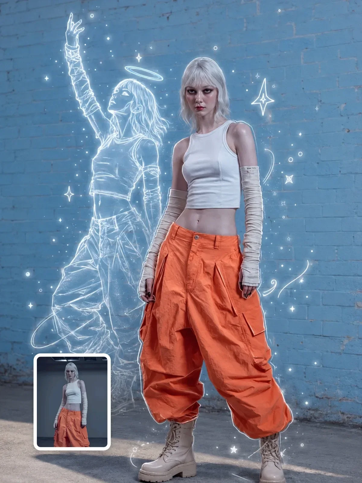
The person stays fully photographic and a drawn version of them appears alongside, as if their sketch came to life. This works especially well in clean editorial settings with plenty of empty space, as in you beside your ink-twin doodle.
Lock the photograph first
The biggest risk in every version is that the model treats the doodle as permission to restyle the whole image. Suddenly the colors shift, the background gets sharper, faces are smoothed and the photo no longer looks like yours. Prevent that by writing the lock before the creative part, in plain, firm language.
Add cute doodles to this photo of me at the beach.
Keep this beach photo exactly as it is: same framing, colors, light, faces and background. Only add thin white hand-drawn lines on top, like gel pen on a printed photo: a small crown above my head, three sparkles near the sunset and a looping arrow from my hand to the sea.
Listing what must stay the same is more reliable than saying don't change anything. Name the framing, colors, lighting, faces and background explicitly. The guide on constraints and negative instructions explains why specific locks beat general ones.
Choose the pen like an illustrator
Doodles feel real when the line looks like it came from a specific tool. Each tool has a line quality the model can reproduce if you name it.
- White gel pen: thin, even, slightly glossy lines that pop on dark or busy photos. The most common choice for overlays.
- Black fineliner: crisp, consistent lines that suit bright, airy photos and clean editorial frames.
- Paint marker: thicker, opaque, slightly uneven strokes with rounded ends; bolder and more playful.
- Wax crayon: waxy, broken texture with gaps where the paper shows; childlike and warm.
- Colored pencil: soft, grainy, layered strokes; gentle and handmade.
Pick one tool and one or two colors. A single white line on a photo looks like a deliberate creative choice; five different pens in five colors looks like clip art. If you want to explore crayon and pencil more broadly, see watercolor, crayon and colored pencil.
Ask for slight wobble and uneven line pressure. Perfectly smooth vector curves are the fastest way to make a hand drawing look computer-made.
Where the doodles go
Good doodle placement follows the same logic as good graphic design: support the subject, do not fight it. A few principles from photo annotation help a lot.
- Trace edges, not faces. Outlines along a shoulder, a hat or a bike frame look clever; lines across eyes and mouths look like vandalism.
- Use the empty space. Skies, walls and tabletops are natural canvases for stars, clouds and small notes.
- Connect things. Arrows and dotted paths from a person to an object tell a tiny story.
- Respect the light. A doodle sun drawn where the real sun is, or sparkles on a real reflection, feels witty because it reacts to the photo.
- Keep a hierarchy. One larger element, such as a crown, wings or a speech bubble, and two to four small ones.
For fashion and lifestyle photos, doodles can extend the outfit: drawn wings from the shoulders, a sketched cape, an extra pattern on a plain T-shirt. The mixed-media doodle fashion editorial keeps a full-body photo intact while drawing playful elements around the pose, and its rooftop sibling applies the same idea outdoors.
Making doodle people look right in a real scene
When people become doodles, the challenge is integration. A drawn figure has no real volume, so it should not cast complex shading on itself. It does, however, stand in a real place, so it needs to sit on the ground with believable contact.
- Keep the drawn figures at the same position, size and pose as the original people.
- Ask for a soft real shadow under the feet so the doodle is anchored to the ground.
- Keep held objects either real or drawn, not half of each; decide which reads better.
- Match the line color to the scene: dark lines on bright beaches, light lines on night streets.
Simplicity is a feature. Dot eyes, a simple smile, rounded hands and flat color fills look intentional. Detailed shading on a doodle makes it look like a failed illustration rather than a sketch.
The sticker variation
A close relative of the trend turns only the main subject into a flat monochrome drawing with a thick white border, like a die-cut sticker stuck onto the real scene. The border is what makes it work: it separates the drawing from the photo the way a real sticker's paper edge would. Ask for thick white die-cut sticker border with a faint drop shadow, and keep the drawing itself to one ink color.
Line weight for the screen it lands on
A doodle that looks delicate at full size can disappear on a phone screen. Most people will see your image at a few centimeters wide in a feed, so very fine lines turn into faint gray hairs. As a rule of thumb, the line should still be clearly visible when you shrink the image to thumbnail size on your own phone.
For feed posts and stories, ask for medium-weight lines, clearly visible at small size. For prints or large wallpapers, thinner gel-pen lines look more refined. Simple shapes also survive shrinking better than detailed ones, which is another reason to favor a crown, a heart or an arrow over intricate patterns.
Two things to handle with care: words and faces
Words inside doodles
Handwritten notes are part of the charm: a date, a place name, a short joke. Keep them to one to three words and ask for simple handwritten lowercase letters. Longer phrases increase the chance of misspellings. If the text matters, generate the doodles without words and add the lettering yourself, or follow the steps in getting clean text in AI images.
Put the exact words after a colon at the end of the instruction, for example handwritten note near the bench: best day. Short, clearly separated text is easier for the model to reproduce.
Other people's faces
Doodling over a friend's photo feels harmless, and usually it is, but the same rule applies as with any edit: ask before you post a transformed picture of someone else, especially when the doodle comments on them. Avoid drawing on strangers who happen to be in the background; blur or crop them out instead. If you share the result publicly, saying that it was edited with AI keeps everyone comfortable.
Five-minute doodle drill
Take one photo of yourself in an open space, such as a park or a plain wall. Generate three versions back to back:
- White gel-pen overlay with one large element and three small ones.
- Yourself as a crayon doodle, with the background untouched and a soft shadow under your feet.
- Yourself beside a black ink twin, both full-body, in a clean minimal frame.
Check each one against the original photo. If anything besides the doodles changed, strengthen the lock and try again. That habit of comparing with the source is what separates tidy mixed-media work from messy edits.